
Losing a member doesn't have to be a total loss. In fact, your membership cancellation form is one of the most honest feedback tools you’ll ever have.
Make the process simple, respectful, and you'll collect gold-standard insights that help you slash future churn. It's your last, best chance to leave a good impression.
Why Your Cancellation Form is Actually a Goldmine
Let’s be honest, nobody likes seeing that "cancel my subscription" email. But instead of viewing it as a failure, see it for what it is: your final opportunity to understand why someone is leaving.
A clunky, guilt-ridden cancellation process doesn’t just lose you one member; it torches your brand's reputation and guarantees they'll never come back. A simple, respectful off-boarding process, on the other hand? That can turn a negative moment into powerful business intelligence.
This isn't just good practice; it's increasingly becoming law. Recent UK government reforms are cracking down on opaque subscription services. The Digital Markets, Competition and Consumers Bill now requires businesses to lay out all key contract details—including cancellation policies—before a customer even thinks about signing up.
It also introduces a mandatory 14-day cooling-off period, giving every new subscriber the right to cancel without penalty. It’s worth taking a look at these consumer protection updates to make sure you're fully compliant.
Build Trust by Making it Easy to Leave
A straightforward cancellation process builds a surprising amount of trust.
When people know they can leave easily, they feel way more comfortable joining in the first place. It kills that nagging fear of being trapped in a subscription they no longer need.
Think of an easy cancellation as a feature, not a failure. It shows you’re confident in your service and you respect your customers' choices. That alone can do wonders for your brand.
Integrating with trusted payment platforms like Stripe is a huge part of this. Their entire interface is built around clarity and security, which is exactly the vibe you want for any financial interaction.
This clean, user-focused approach is a perfect model for how your entire membership backend should feel: professional, clear, and dead simple for the user.
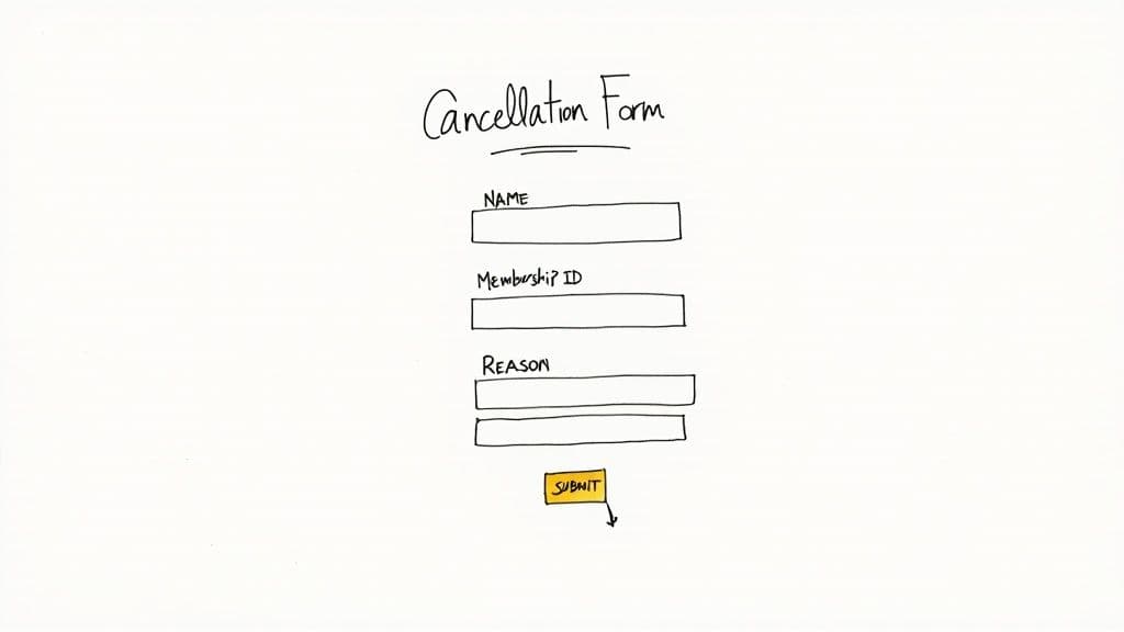
Designing a Form That Gathers Actionable Feedback
Building a membership cancellation form that doesn't make people angry is a genuine art. It's a tricky balancing act between your need for data and the member’s desire to just get out, quickly and without any drama. The real goal here is to move past the basic "who are you" fields and create a feedback section that actually tells you something useful.
A good form feels less like an interrogation and more like a final, respectful chat. I always recommend starting with the most important question right up front, using a multiple-choice format: “What’s the main reason you’re leaving?” This setup makes it super easy for users to give you categorised data in a single click.
Pinpointing the Real Reasons for Churn
To get answers that mean something, your options have to reflect common pain points. If you run a gym, for example, you should know that UK data shows cost (41%), lack of time (24%), and feeling disconnected from the community (40%) are the biggest reasons people cancel. These stats prove that money and engagement issues are huge, so they absolutely need to be options on your form.
So, based on that, your multiple-choice list could look something like this:
- Pricing and Value: "The membership fee is too high for the value I get."
- Usage and Time: "I'm just not using the service enough to justify it."
- Content or Service Issues: "I'm not finding the features/content useful."
- Technical Problems: "I ran into too many technical glitches."
Always, and I mean always, include an optional open-text field. Label it something friendly like, "Is there anything else you'd like to share?" This is where the gold is. It gives people a chance to explain the nuance that a multiple-choice question just can't capture. Making it optional is key—it keeps the process frictionless for those in a hurry.
This mix of structured and unstructured feedback is incredibly powerful. For a deeper look, we've put together a full guide on the best ways for collecting customer feedback.
Done right, your cancellation form stops being a simple offboarding tool and becomes a strategic asset. It hands you clear, actionable data to help you cut down on future churn and make your service better for everyone who stays.
We need a way to structure this information clearly. Let's break down the essential fields for a cancellation form that balances data collection with a smooth user experience.
Essential Fields for Your Cancellation Form
A solid form doesn't need to be long, but it does need to be smart. Here's a breakdown of the fields I've found to be most effective.
| Field Type | Purpose | Best Practice Example |
|---|---|---|
| Multiple-Choice | To get categorised, easy-to-analyse data on the primary reason for leaving. | "What's the main reason you're cancelling?" with options like 'Cost', 'Not using enough', 'Technical issues'. |
| Open-Text Field | To capture detailed, nuanced feedback that multiple-choice can't. This is often where the most valuable insights live. | "Could you tell us a bit more? (Optional)" |
| User Identification | To link the feedback directly to a specific user account for context (e.g., membership level, join date). | Auto-populated fields for Name and Email. Don't make them re-enter it. |
| Follow-up Opt-in | To get permission to contact the user for more detailed feedback, turning a cancellation into a user research opportunity. | A simple checkbox: "Is it okay for us to contact you for a brief chat about your experience?" |
| Win-back Offer (Optional) | To present a last-chance offer to retain the member, based on their cancellation reason. | If 'Cost' is selected, you could dynamically show: "Would a 25% discount for 3 months change your mind?" |
ec38ecdd-f819-4184-b70b-4654c025585d.jpg
Ultimately, the goal is to make the process respectful and insightful. You get the data you need to improve, and the departing member feels heard, not harassed. That's a win, even when you're losing a customer.
Connecting Your Form with Stripe for Automation
So, you’ve designed a form that gets you some real, honest feedback. What’s next? You need to make it work for you.
Manually processing cancellations is a nightmare. It’s one of those tedious admin tasks just waiting to go wrong. Someone on your team forgets to cancel a subscription in Stripe, and suddenly you’re dealing with an angry email, a refund request, and a seriously frustrated ex-member.
This is exactly where automation becomes your best friend.
Hooking your cancellation form directly into your Stripe account kills that entire manual process. When a member hits ‘submit,’ the form doesn’t just log their feedback—it instantly fires off an API call telling Stripe to cancel their active subscription. The action is immediate, it's accurate, and it requires zero effort from you or your team.
Setting Up the Stripe Integration
The technical side of this might sound a bit daunting, but with a platform like MyMembers, it's actually pretty simple. The system is built to do all the heavy lifting for you. All you really need to do is make sure your form is correctly mapped to your Stripe customer data.
This just means linking specific fields from your form to the right data points in Stripe. For example, the user's email address or a unique member ID from your form needs to match up with the customer record over in Stripe. This mapping is how the system knows exactly which subscription to cancel.
By linking your form to your payment tools, you can automate repetitive tasks and free up a surprising amount of time. Instead of drowning in cancellation admin, you can focus on what really matters—analysing the feedback you've just collected.
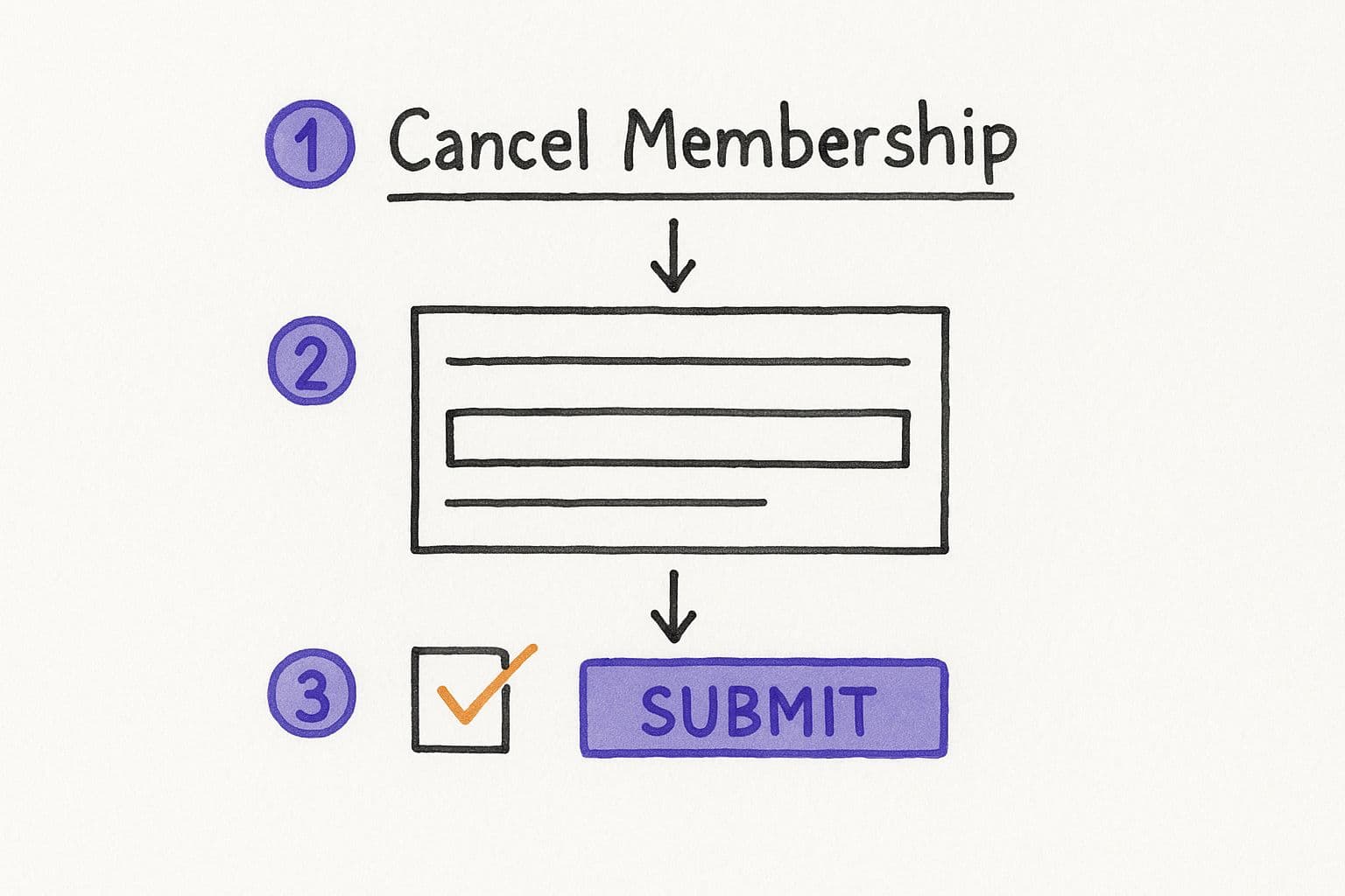
The flow is straightforward: a form submission triggers a pre-set action that talks directly to Stripe’s system. This wireframe shows the basic elements your user will see.
be4c06d5-2717-42d4-8a3a-7bec618c7a94.jpg
This visual breaks down the user journey into its simplest parts: identifying their account, confirming their choice, and finalising the whole thing with a single click. A clean path like this is crucial.
The real win here is consistency and reliability. Every single cancellation is processed in exactly the same way, every single time. This completely removes the risk of human error and guarantees a smooth, professional offboarding experience for every member who decides to leave.
Verifying the Connection and Next Steps
Once you've got the integration set up, don't skip the final check. Always run a test with a trial account. Go through the form yourself and then pop over to your Stripe dashboard to confirm the subscription was actually cancelled. Trust me, this simple check can save you from major headaches later on.
After you've confirmed it's all working, you’ve officially created a closed-loop system. This setup doesn't just handle the cancellation; it also creates a clean data trail for your records. You can learn more about how this impacts your books in our guide to https://mymembers.io/blog/automated-payment-reconciliation.
Ultimately, this workflow transforms your cancellation form from a static page into a powerful, efficient business tool.
Using Form Data to Trigger Retention Offers
A cancellation request isn't the final word; it's the start of a conversation. The feedback you get from that little form is way too valuable to just sit in a spreadsheet somewhere. Its real power is in using it to fire off smart, automated retention offers the second a member hits 'submit'.

embed
This turns your form from a simple offboarding tool into an active defence against churn. It’s your last, best shot to keep a customer by solving their specific problem right when they tell you about it.
Picture this: a member selects ‘It’s too expensive’ as their reason for leaving. Instead of a dead-end "sorry to see you go" page, your system instantly sends them an email offering a 25% discount for three months. Or maybe it links them to a cheaper membership tier they didn't even know existed.
This isn’t about being pushy. It’s about offering an immediate, relevant solution.
Tailoring Offers to Specific Feedback
The secret is to match the offer directly to the problem. If someone says they’re ‘Not using it enough,’ a discount is completely pointless. What they really need is a membership pause. This works wonders for services like gyms, where people’s attendance can dip depending on the season.
A 2025 survey of UK gym members found that 27% stop going within just 3-4 months. That’s a massive window where a flexible pause option could prevent them from cancelling for good. You can read more about UK consumer habits and wasted memberships to see just how common this is.
Think about setting up these kinds of automated replies:
- Reason: ‘Technical issues’ → Offer: An email with a direct link to book a free 15-minute support call.
- Reason: ‘Missing key features’ → Offer: An invite to a beta programme for upcoming features they might actually want.
- Reason: ‘Found a better alternative’ → Offer: A personal message asking what the other service offers, showing you genuinely value their feedback.
By automating these personalised responses, you turn a moment of loss into a real opportunity. You’re not just trying to save a subscription; you’re showing the customer you're listening and are willing to adapt to what they need.
Turning Cancellation Insights into Lower Churn
Let's be honest, the real gold in your cancellation form isn't just about making the exit smooth. It’s about building a powerful feedback loop. The data you're collecting is a straight-up roadmap for cutting future churn, but only if you actually look at it. This simple offboarding step can become a strategic powerhouse for making your business better.
Start by getting that feedback organised. For multiple-choice answers like “It's too expensive,” you can whip up simple charts to see how trends change over time. Did you see a spike in cost-related cancellations right after a price change? That's a massive signal to take another look at your pricing tiers or beef up your value proposition.
From Raw Data to Action
Now, that open-text feedback? That requires a more hands-on approach. You need to get in there and look for recurring words or themes. If you see multiple people mentioning a “confusing interface” or a “lack of advanced features,” you’ve just been handed your next product development priority on a silver platter.
Don't let this goldmine of information just sit in a spreadsheet gathering digital dust. Make it a ritual. Schedule a monthly or quarterly review with your team to dig into cancellation trends. This consistent analysis is the only way to bridge the gap between just collecting feedback and actually taking meaningful action to improve your service.
When you start monitoring your churn rate alongside all this qualitative data, you'll see the direct impact of the improvements you make. This whole process is central to building a more resilient business. By getting to the root causes of why people leave, you end up building a much better service for everyone who decides to stay.
(You can dive deeper into these strategies in our complete guide to customer retention best practices).
Got Questions About Cancellation Forms? We've Got Answers

35fc83ff-61a5-45ae-955d-cbfb58143b87.jpg
Even with the best plan, you're going to have questions when you set up a new process. It’s totally normal. Let's run through a few of the most common ones I hear when building out a membership cancellation form.
The absolute number one question you need to ask a departing member is, “What’s your main reason for leaving?”
Make this a simple multiple-choice question, but always—always—include an "Other (please specify)" field. This single piece of feedback is pure gold. It’s how you spot trends and figure out if churn is being driven by your pricing, a missing feature, or something you hadn't even thought of.
Should I Try to Save the Customer on the Form Itself?
This is a tricky one, and it's all about balance. Yes, you can (and probably should) present a last-ditch retention offer. Maybe it’s a discount for the next three months or an option to pause their membership instead of cancelling outright.
But whatever you do, don't make it a trap. The offer needs to be clear, but the "No thanks, just cancel my account" button must be just as easy to find and click.
Getting too aggressive here doesn't just feel desperate; it leaves a horrible final impression. It can also get you into hot water with UK consumer rights regulations, which are designed to prevent exactly this kind of friction.
How Can I Automate the Process After Submission?
Automation here isn't a "nice-to-have"—it's essential. The moment a member hits that final cancellation button, your form should trigger an API call to your payment gateway (like Stripe) and kill the subscription on the spot. No delays, no manual work.
This is exactly where a dedicated tool like MyMembers really proves its worth. It acts as the bridge between your form and Stripe, making sure the cancellation is instant and error-free. More importantly, it logs all that precious feedback data so you can analyse it later and make smarter decisions.
Ready to turn your Telegram community into a thriving business? With MyMembers, you can set up automated payments, manage subscribers, and analyse your revenue without writing a single line of code. Start monetising your audience today with MyMembers.